Ayat al-Kursi wall art: meaning, styles and how to display it
7 min readZara Tahir
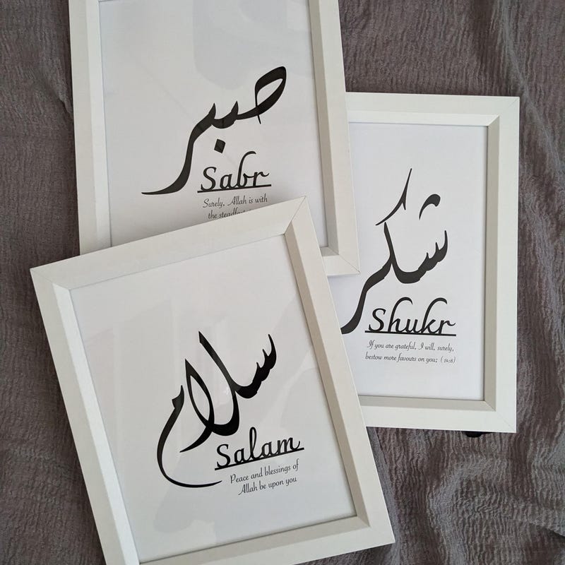
Ayat al-Kursi is the verse people ask me for more than any other. It is the 255th verse of Surah al-Baqarah, the second chapter of the Qur'an, and it is widely known as the Verse of the Throne.
This guide covers what it is, how it is usually set as calligraphy, and the practical side — size, script, placement — so the piece you choose suits both the verse and the room.
What the verse is
Ayat al-Kursi describes the absolute sovereignty and knowledge of God. It is a single long verse, held in high regard across Muslim communities, and it is commonly recited for protection — before sleep, when leaving the house, or at the start of the day.
That everyday familiarity is exactly why it works so well on a wall. It is not decoration standing in for meaning; it is a text that many households already recite from memory, given a physical place in the home.
I am a designer rather than a scholar, so I will not attempt an interpretation here beyond that. If you want to read about the verse itself, go to a source qualified to explain it. What I can help with is how it is set, sized and hung.
Why it is harder to set than a single word
Ayat al-Kursi is long. A single word like 'Alhamdulillah' can be set enormous and centred, and the design more or less resolves itself. A full verse has to be composed — broken into lines, balanced, and given a shape.
That is the real design decision behind any Ayat al-Kursi piece: how the text is arranged. Three broad approaches come up again and again, and each behaves differently on a wall.
- A justified block — the verse set as even lines forming a rectangle. Calm, architectural, very legible.
- A shaped composition — the text arranged into a circle, arch or oval, echoing traditional manuscript and architectural calligraphy.
- A flowing single-column setting — tall and narrow, suited to a slim wall, a chimney breast or the space beside a door.
The scripts you will see
Thuluth is the classical display script: tall verticals, deep sweeping curves, and a strong sense of ceremony. It is what most people picture when they imagine mosque calligraphy, and it carries a long verse with real presence. It needs size, though — set too small, the strokes crowd each other.
Naskh is the reading script. Rounder, more even, designed for text at length, and it stays clear at smaller sizes. For a full verse at A3 or A4, Naskh is usually the more sensible choice, and it is the easier one to actually read from across a room.
Kufic is angular and geometric, squared off with almost no curves. Set as a block it looks like architecture, and it sits beautifully in a modern interior — though it is the least immediately readable of the three for most people.
Modern brush and outline lettering is a fourth route. Less traditional and more graphic, and honest about being contemporary. Whether it suits you is a matter of taste rather than correctness.
Size: this is the one to get right
A long verse needs more physical space than a short phrase, and this is where most disappointment comes from. At A4, a full Ayat al-Kursi is intimate — something to be read at arm's length in a hallway or beside a bed. It will not carry a living room wall.
For a living room, I would not go below A3, and A2 is where a full verse starts to feel properly resolved. If it is a feature wall with nothing else on it, A1 is not too much.
Apply the same two-thirds guide as for any wall art: the piece should span roughly two thirds of the width of the furniture beneath it. And measure before you buy, because a verse-length composition at the wrong size reads as cramped rather than restrained.
Where to hang it
The most common places, and the ones I think work best, are the living room, the entrance hall and the main bedroom. Each for a different reason: the living room because it is where the household gathers, the hall because it is what you pass on the way in and out, the bedroom because of the verse's association with sleep.
In a hallway, hang it at eye level on the wall you face rather than the one you walk along — a piece you glance at head-on gets read; one you pass side-on does not. Halls are also narrow, which makes them a good home for the tall single-column settings.
In a living room, centre it on the wall or on the furniture and leave 15–20cm between the sofa back and the frame. Above a bed, keep it centred on the bed rather than the wall, and hang a little higher than you would elsewhere so it clears the headboard cleanly.
Two things to avoid, and this is a matter of respect rather than design: a wall where the piece will be knocked or scuffed in passing, and the bathroom. Somewhere the piece can sit undisturbed and be read is the point.
Framing and finish
Black frames sharpen the letterforms and make the piece read as graphic and deliberate. Oak warms it, softens the contrast, and works well against cream or warm white walls. White frames almost disappear, which is useful when you want the calligraphy alone to register.
If the piece is going to be the only thing on a large wall, a slightly wider frame profile gives it more weight without changing the print size. If it is joining an existing group, match the frames you already have exactly — that matters more than which finish you would choose in isolation.
A last practical note: keep it out of direct sunlight where you can. Any print will fade over years in a south-facing window, and the piece you have chosen for this verse is one you want to keep.