How to choose Islamic wall art for your living room
6 min readZara Tahir
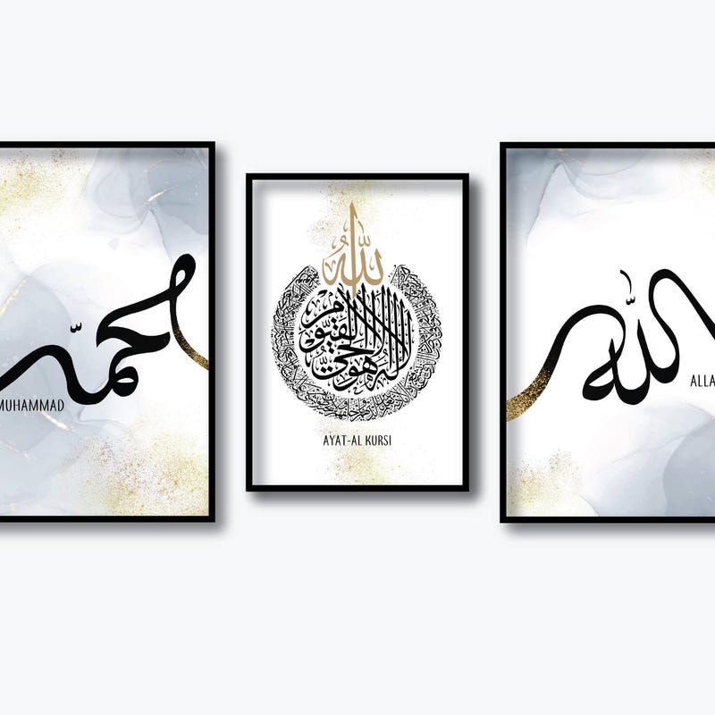
The question I get asked most is which design to buy. Almost always, the more useful question is where it is going and how big the wall is — because the same print can look considered above one sofa and lost above another.
This is how I would work through it if I were standing in your living room with a tape measure, in the order I would actually do it.
Start with the wall, not the design
Measure the wall, and then measure whatever sits beneath it. The furniture is the thing your artwork has to relate to, and it is the reason a print that looked perfect on screen can arrive feeling small. A standard three-seater sofa is around 200–210cm wide; a two-seater is nearer 150cm; a console table is often only 90–100cm.
Then decide what job the piece is doing. Is it the thing you want people to notice as they come in, or a quieter detail that rewards a second look? A statement piece wants scale and space around it. A quieter one can sit lower, closer to a shelf or a plant, and be found rather than announced.
Finally, look at what is already competing for attention. A patterned rug, a busy bookshelf and strong curtains are all doing visual work. In a room like that, one calm print will do more than three.
The two-thirds rule for size
The most reliable sizing guide I use is two thirds: the artwork, or the group of pieces taken together, should span roughly two thirds of the width of the furniture below it. Above a three-seater that means around 130–140cm of artwork, which is a large single piece or a group.
In practical print sizes, that works out roughly like this — and it is worth reading these as starting points rather than rules:
- Above a three-seater sofa: one A2, or a trio of A4s, or a pair of A3s
- Above a two-seater or armchair: one A3, or a pair of A4s
- Above a console table or in an alcove: A4 to A3, read close up
- A large empty feature wall: A1 or larger, or a deliberate group of five
How high to hang it
Height is where most walls go wrong, and it is the easiest thing to fix. Aim for the centre of the piece to sit at about eye level — roughly 145–150cm from the floor. Galleries use something close to this for a reason: it is the height at which a standing adult reads an image comfortably.
When you hang above furniture, the gap matters more than the absolute height. Leave about a hand's width — 15 to 20cm — between the top of the sofa back and the bottom of the frame. Any more and the piece detaches and floats towards the ceiling. Any less and it looks like it has slipped down.
One adjustment: in a room where you are almost always sitting — a snug, a TV room — drop everything by 5 to 10cm. You will be looking at it from lower down.
Trio or single piece?
A single print is the calmer choice and the more forgiving one. There is one nail, one centre line, and nothing to align. It suits a room that is already full, and it suits a wall with a natural centre — above a fireplace, between two windows, at the end of a hallway.
A trio turns the wall itself into the composition. Three pieces read as one wide horizontal band, which is why trios work so well above seating and above beds: they follow the shape of the furniture. They also give you something a single piece cannot — rhythm. The eye moves along them.
Pairs are the hardest to get right, because two objects invite comparison. They work when they are unmistakably a set: the same script, the same layout, the same colour, one word or verse each. If two prints are only loosely related, hang them in different rooms.
Spacing, and the mistake almost everyone makes
Groups fail on spacing far more often than on the choice of prints. When pieces hang too far apart they stop being a group and become several unrelated objects sharing a wall. Keep the gaps between frames in one group to 4–6cm. It will look tight while you are holding them up. It looks right once they are on the wall.
Keep the gaps identical, too — measure rather than eyeball, and align the centres horizontally rather than the tops of the frames if the sizes differ. Cut paper templates and tape them up first; it takes ten minutes and saves a wall full of holes.
The second mistake is mixing frames within one group. Different profiles and finishes in the same cluster read as accidental. Keep them identical inside a group; vary them between groups if you like.
Colour, script and living with it
I design most pieces in warm neutrals — cream, sand, ink, soft charcoal — because neutrals let the letterforms carry the piece and they do not date the room. If your walls are warm white or cream, a cream ground will settle in and feel built-in. If your walls are cool grey or bright white, ink on cream gives you the contrast the room needs.
On script: Thuluth, with its tall sweeping strokes, has the most drama and suits a large single piece. Naskh is rounder and more even, and stays legible at smaller sizes, which makes it the better choice for a trio or a piece you read close up. Kufic is angular and architectural and sits particularly well in a modern room with hard edges and plain walls.
For a child's room, scale down and soften. Gentler lettering, a lighter ground and a lower hanging height — around the child's eye level rather than yours — make the piece feel like it belongs to them.
Last thought: buy for the wall you have, not the room you are planning. If a redecoration is coming, neutral grounds and one consistent frame finish will survive it, which is more than can be said for most wall art.