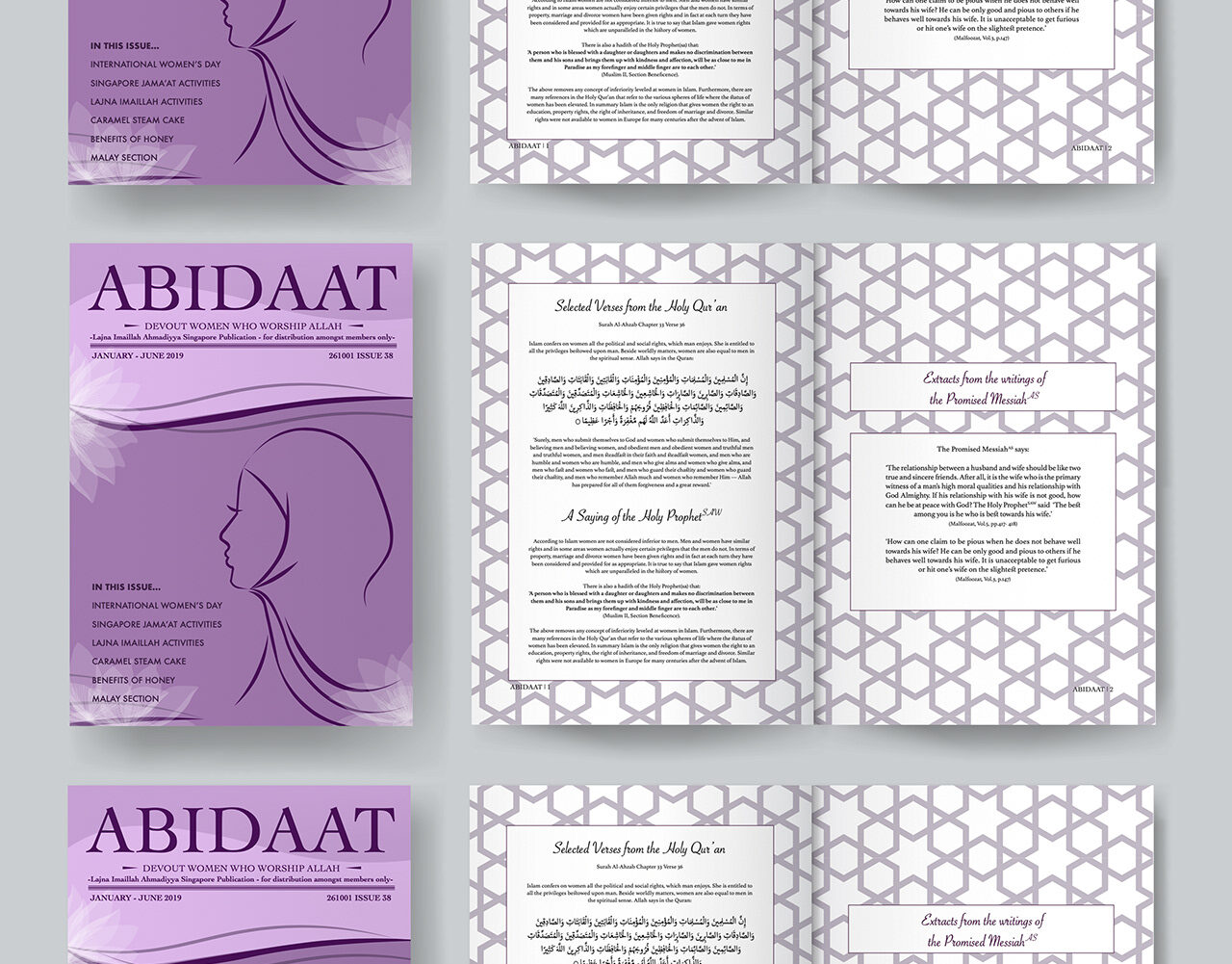
Publication Design
Abidaat
A quarterly magazine for Lajna Imaillah Ahmadiyya Singapore: a redesigned masthead and cover system, and the editorial pages behind it.
- Client
- Lajna Imaillah Ahmadiyya Singapore
- Role
- Publication design, typesetting, layout
- Disciplines
- Publication, Print
The challenge
Devotional text is read slowly, often repeatedly, and sometimes aloud. It needs a page that supports careful reading — generous line spacing, no visual interruptions, and a structure that lets someone find their place again immediately.
The approach
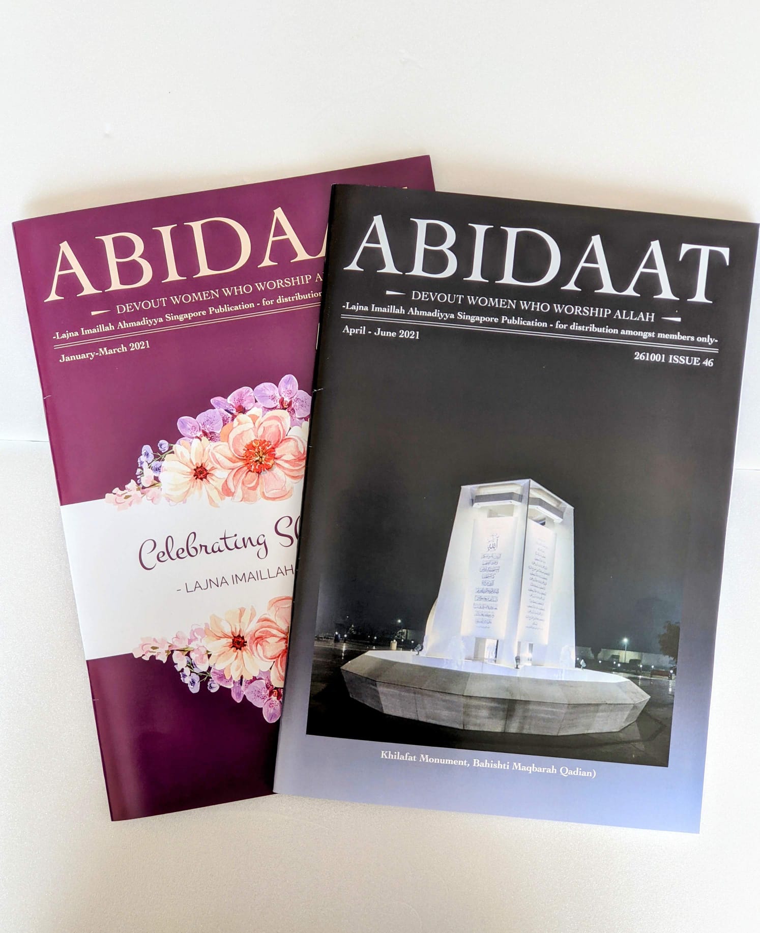
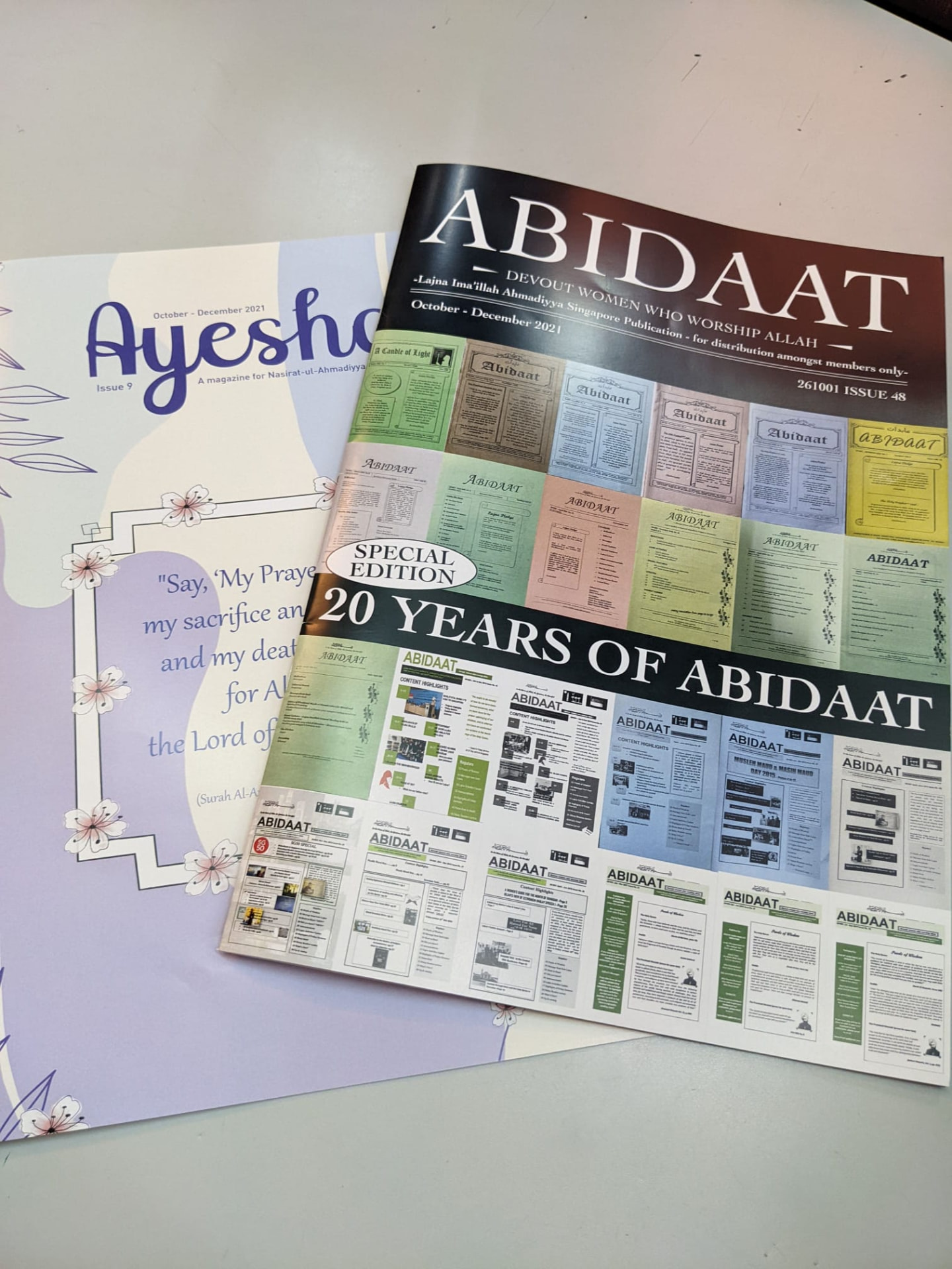
I used a single text column with deep outer margins and open leading, so the eye returns cleanly to the start of each line. Section markers are set as small, wide-spaced capitals rather than heavy headings, and ornament is reduced to one repeated device. Nothing on the page competes with the passage being read. On the covers, the masthead and strapline never move; only the ground and the image change, so a floral celebration issue, a night photograph of the Khilafat monument and a collage of twenty years of front pages all read as the same magazine.
The outcome
The publication supports slow, repeated reading rather than skimming, and its structure stays legible in one-colour print. Production details to be confirmed. Designed across 2021 and 2022, including the twentieth-anniversary special edition.